With CSS, we can create simple shapes like rectangles and triangles as well as bit complicated shapes like stars, hearts, diamonds, etc. In this blog post, I'll talk about how to create basic shapes like rectangles, circles, and triangles by using pure CSS. So, let's get started.
Squares and Rectangles
Squares and rectangles are the simplest shapes to make in CSS. First, we have to create a div and then give it a height and a width.
HTML
<div class="shape"></div>
CSS
.shape{
  width: 20rem;
  height: 12rem;
  background: #4d4dff;
}
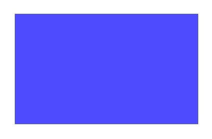
If you want a square, you have to give the same value for the height and width.
Circles and Ellipses
To create circles and ellipses, we use the CSS border-radius property.
If you don't know about the border-radius property, you can learn about it in MDN Web Docs.
To get a circle, we just have to create a square and set the border-radius to 50%.
HTML
<div class="circle"></div>
CSS
.circle{
  width: 15rem;
  height: 15rem;
  border-radius: 50%;
  background: #4d4dff;
}
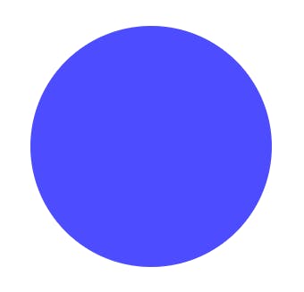
In the same way, by setting the border-radius of a rectangle to 50%, we can get an ellipse.
Half and Quarter Ellipses
Half Ellipses
Sets of values separated by the slash (/) symbol can be used to define the horizontal and vertical radii of half-ellipses. A vertical half-ellipse is created by putting 50% before the slash symbol.
HTML
<div class="half-ellipse-1"></div>
<div class="half-ellipse-2"></div>
CSS
.half-ellipse-1{
  width: 15rem;
  height: 17rem;
  border-radius: 50% / 100% 100% 0 0;
  background: #4d4dff;
}

.half-ellipse-2{
  width: 15rem;
  height: 17rem;
  border-radius: 50% / 0 0 100% 100%;
  background: #4d4dff;
}
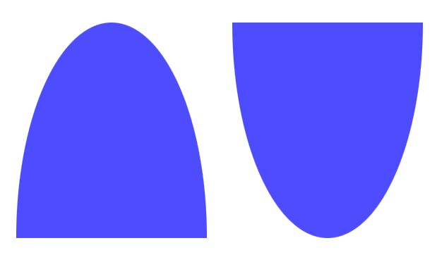
We can also make a horizontal half-ellipse by adding 50% after the slash symbol. HTML
<div class="half-ellipse-3"></div>
<div class="half-ellipse-4"></div>
CSS
.half-ellipse-3{
  width: 15rem;
  height: 17rem;
  border-radius:  100% 0 0 100%  / 50%;
  background: #4d4dff;
}

.half-ellipse-4{
  width: 15rem;
  height: 17rem;
  border-radius:  0 100% 100%  0/ 50%;
  background: #4d4dff;
}
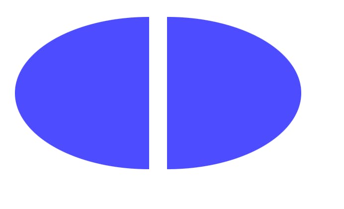
The orientation of your half-ellipse is determined by a combination of 0 and 100% values.
Quarter Ellipses
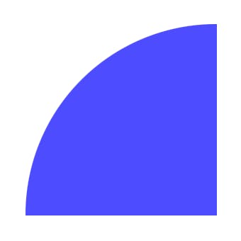
We can make quarter-ellipses by using combinations of 0 and 100% values.
HTML
<div class="quarter-ellipse-1"></div>
CSS
.quarter-ellipse-1{
  width: 15rem;
  height: 15rem;
  border-radius: 100% 0 0 0;
  background: #4d4dff;
}
Triangles
We can create triangles by using the CSS property called border property.
If you don't know about the border property, you can learn about it in MDN Web Docs.
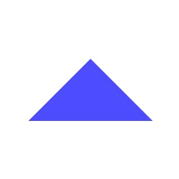
To create a triangle, first, we set the width and height of the element to zero. Then the width of the border will be the actual width of the element. There are four borders for each of the four sides of the element, and edges of these borders are 45-degrees diagonal to each other.
We can get a triangle by giving a color to one of the borders and setting the colors of other three to transparent.
HTML
<div class="triangle-1"></div>
CSS
.triangle-1{
 height: 0;
 width: 0;
 border-top: 5em solid transparent;
 border-right: 5em solid transparent;
 border-bottom: 5em solid #4d4dff;
 border-left: 5em solid transparent;
}
We can also make right-angled triangles by using the same technique. To do that, we have to make the top or bottom colored and leave the right or left border transparent.
HTML
<div class="triangle-1"></div>
CSS
.triangle-1{
 height: 0;
 width: 0;
 border-top: 100px solid #4d4dff;
  border-right: 100px solid transparent;
}

Conclusion
In this blog post, I talked about how to create some basic shapes using CSS. In another blog post, I'll talk about how to create bit complicated shapes like hearts and stars.
I hope you find this post useful, and follow me on twitter for the updates on the 2nd part of this blog post.
