

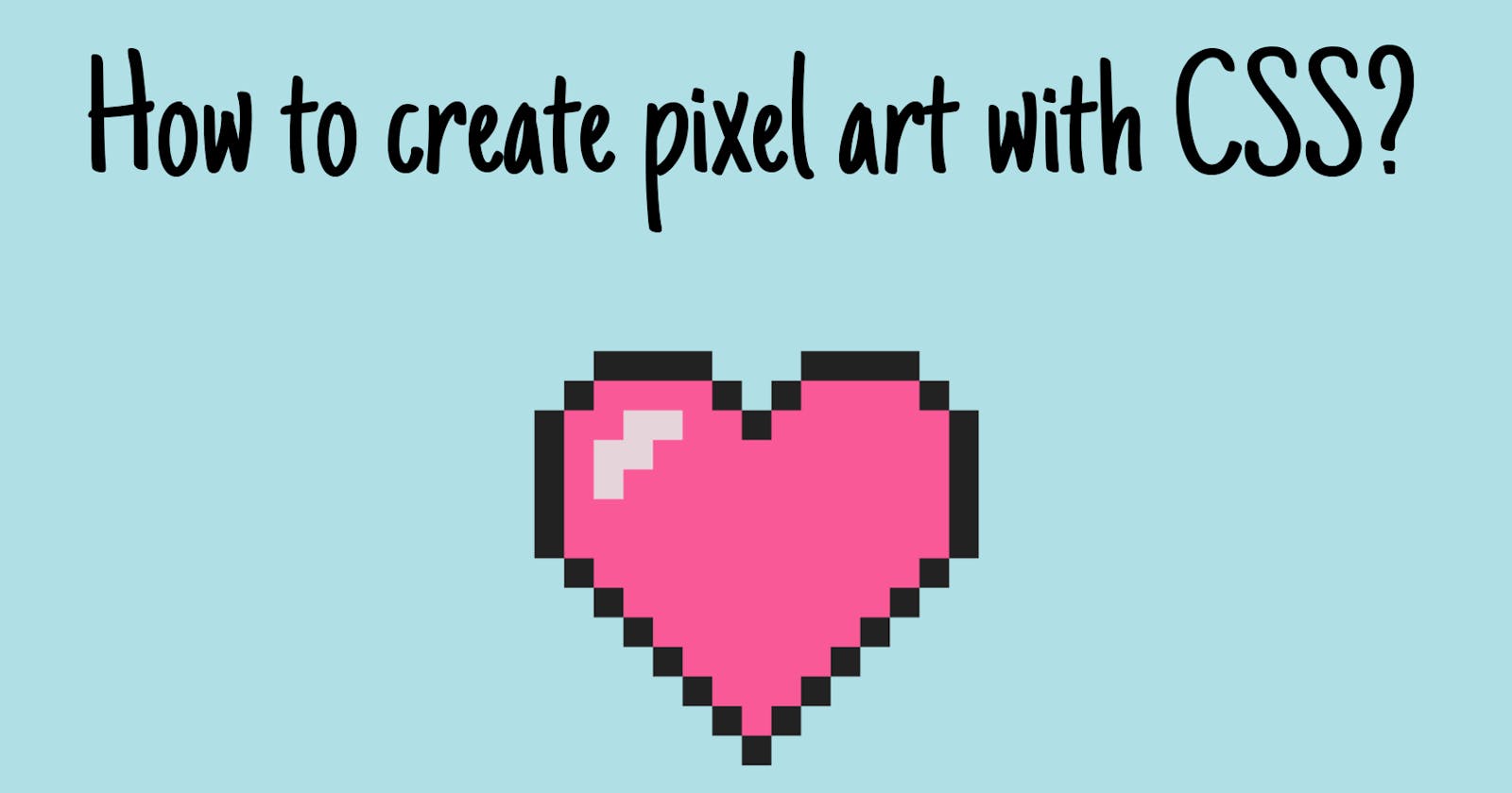
Pixel art is a type of digital art in which images are created and edited at the pixel level using graphic editing software like Adobe Photoshop. Pixel art is defined by its unique visual style, in which each pixel acts as the building block which makes up the image. The result is a visual style similar to mosaic art, cross-stitch, and other embroidery methods.
Today, I'm going to show you how to create simple pixel art using pure CSS. You don't need any fancy software like Adobe Photoshop to create pixel arts this way.
To create this pixel art, I'm going to use the box-shadow CSS property.
The box-shadow property adds shadow effects around an element's frame. You can set multiple effects separated by commas. A box-shadow is described by X and Y offsets relative to the element, blur and spread radius, and color.
box-shadow: 10px 5px 5px red;
The result will be something like this.
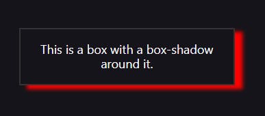
NOTE: You can learn more about the box-shadow CSS property in MDN Web Docs.
I hope you got a better understanding of the box-shadow CSS property. So, it's time to start creating our beautiful pixel art.
If this is your first time creating pixel art with CSS, you might need to follow all the steps. But the next time you're doing it, you will be able to skip most of these steps.
First of all, you might need to draw the shape you want to create with CSS on a piece of paper. Here's the one I drew.
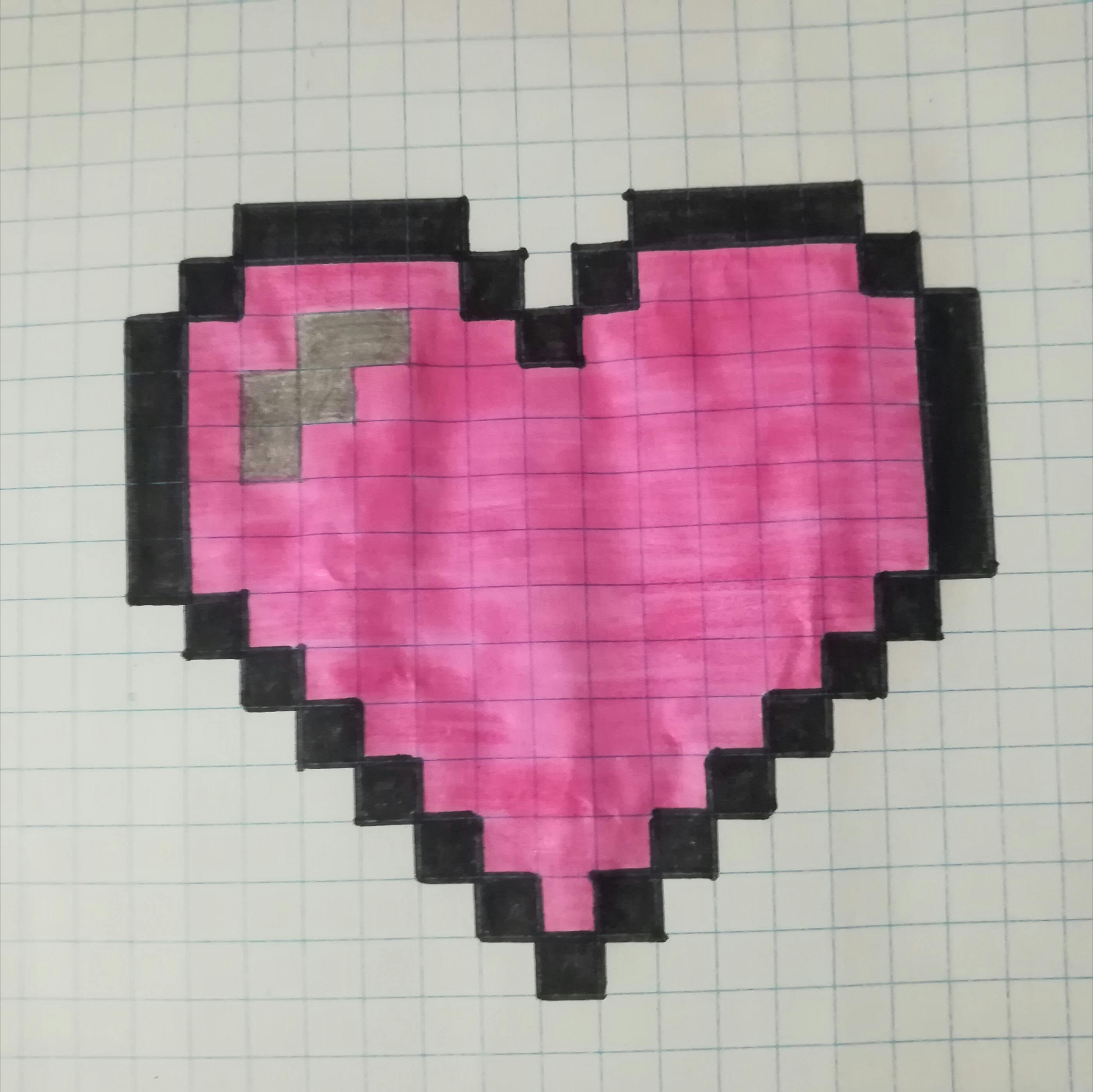
It doesn't matter if you're not good at drawing (just like me). We only need this to use as a guide for creating our pixel art. So just draw it without thinking about how to make it pretty. We are going to make the digital version look way better anyway.
We'll start by creating two divs.
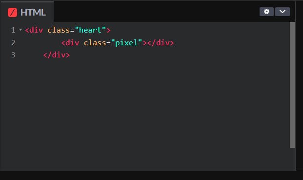
I gave two classes, "heart" and "pixel" to, the outer div and inner div, respectively. I'll use the outer div to bring the whole picture to the center of the screen. And, I'll use the inner div to generate the pixels of the picture we're going to create.
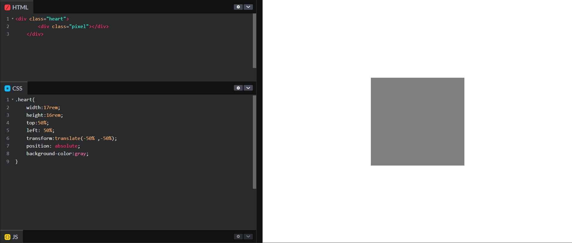
Now, add these styles to the outer div to bring it to the center of the screen.
.heart{
    width:17rem;
    height:16rem;
    top:50%;
    left: 50%;
    transform:translate(-50% ,-50%);
    position: absolute;
    background-color:gray;
}
You can set the height and the width of the div according to the size of the picture you drew on the paper. (I added a background color just to see what's happening to the div. we'll remove it later.)
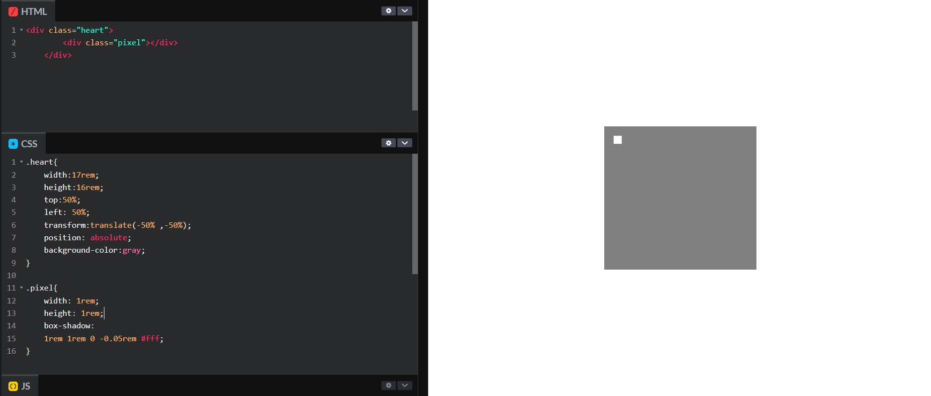
Now, we're going to create a pixel grid inside this gray-colored box. This is how you add the first pixel of the grid.
.pixel{
    width: 1rem;
    height: 1rem;
    box-shadow:
    1rem 1rem 0 -0.05rem #fff;
}
NOTE:
box-shadow: 1rem 1rem 0 -0.05rem #fff;Here, the offset-y and the offset-x represent the row number and the column number of the pixel in the pixel grid, respectively.
By adding this to the box shadow, you can create the first row of the pixel grid.
box-shadow:
    1rem 1rem 0 -0.05rem #fff,
    2rem 1rem 0 -0.05rem #fff,
    3rem 1rem 0 -0.05rem #fff,
    4rem 1rem 0 -0.05rem #fff,
    5rem 1rem 0 -0.05rem #fff,
    6rem 1rem 0 -0.05rem #fff,
    7rem 1rem 0 -0.05rem #fff,
    8rem 1rem 0 -0.05rem #fff,
    9rem 1rem 0 -0.05rem #fff,
    10rem 1rem 0 -0.05rem #fff,
    11rem 1rem 0 -0.05rem #fff,
    12rem 1rem 0 -0.05rem #fff,
    13rem 1rem 0 -0.05rem #fff,
    14rem 1rem 0 -0.05rem #fff,
    15rem 1rem 0 -0.05rem #fff;

Now, you can create the whole pixel grid by copy-pasting the values we added to get the first row of the pixel grid and then changing the offset-y accordingly.
To add the first two rows, you can add this to the box-shadow.
box-shadow:
    1rem 1rem 0 -0.05rem #fff,
    2rem 1rem 0 -0.05rem #fff,
    3rem 1rem 0 -0.05rem #fff,
    4rem 1rem 0 -0.05rem #fff,
    5rem 1rem 0 -0.05rem #fff,
    6rem 1rem 0 -0.05rem #fff,
    7rem 1rem 0 -0.05rem #fff,
    8rem 1rem 0 -0.05rem #fff,
    9rem 1rem 0 -0.05rem #fff,
    10rem 1rem 0 -0.05rem #fff,
    11rem 1rem 0 -0.05rem #fff,
    12rem 1rem 0 -0.05rem #fff,
    13rem 1rem 0 -0.05rem #fff,
    14rem 1rem 0 -0.05rem #fff,
    15rem 1rem 0 -0.05rem #fff,

    1rem 2rem 0 -0.05rem #fff,
    2rem 2rem 0 -0.05rem #fff,
    3rem 2rem 0 -0.05rem #fff,
    4rem 2rem 0 -0.05rem #fff,
    5rem 2rem 0 -0.05rem #fff,
    6rem 2rem 0 -0.05rem #fff,
    7rem 2rem 0 -0.05rem #fff,
    8rem 2rem 0 -0.05rem #fff,
    9rem 2rem 0 -0.05rem #fff,
    10rem 2rem 0 -0.05rem #fff,
    11rem 2rem 0 -0.05rem #fff,
    12rem 2rem 0 -0.05rem #fff,
    13rem 2rem 0 -0.05rem #fff,
    14rem 2rem 0 -0.05rem #fff,
    15rem 2rem 0 -0.05rem #fff;
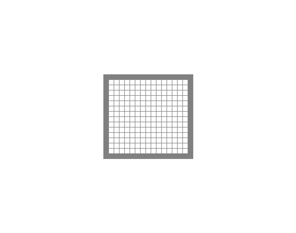
After adding all the pixels to the grid, it'll look like this.
Now we can start coloring the pixels to get the shape we drew on the piece of paper. You can do it by changing the color of the pixels from white to the color you want. This is how you color the relevant pixels of the first row.
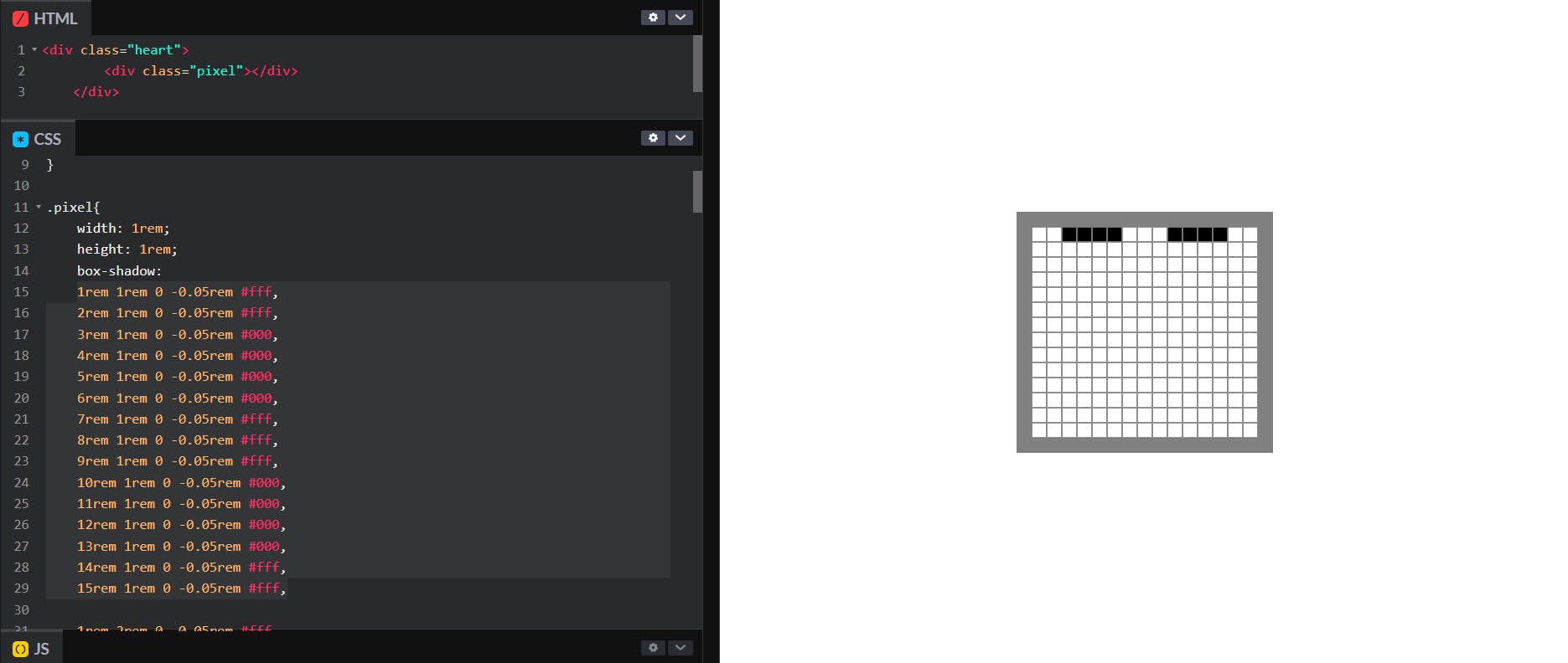
After coloring all the relevant pixels, you'll get something like this.
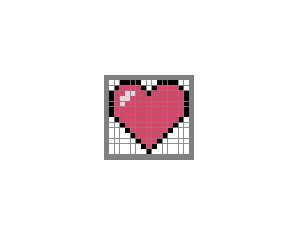
Now, remove all the unused white-colored pixels of the grid and the background color of the outer div. Then you'll see something like this.
To make it look better, set the spread radius of all the pixels to zero.

NOTE: Now, the blur radius and the spread radius of all the pixels are zero. So you can remove these values from the code.
.pixel{
    width: 1rem;
    height: 1rem;
    box-shadow:
    /* row1 */
    3rem 1rem #000, 4rem 1rem #000, 5rem 1rem #000, 6rem 1rem #000, 10rem 1rem #000, 11rem 1rem #000, 12rem 1rem #000, 13rem 1rem #000,
    /* row2 */
    2rem 2rem #000, 3rem 2rem rgb(223, 65, 105), 4rem 2rem rgb(223, 65, 105), 5rem 2rem rgb(223, 65, 105), 6rem 2rem rgb(223, 65, 105), 7rem 2rem #000, 9rem 2rem #000, 10rem 2rem rgb(223, 65, 105), 11rem 2rem rgb(223, 65, 105), 12rem 2rem rgb(223, 65, 105), 13rem 2rem rgb(223, 65, 105), 14rem 2rem #000,
    /* row3 */
    1rem 3rem #000, 2rem 3rem rgb(223, 65, 105), 3rem 3rem rgb(223, 65, 105), 4rem 3rem rgb(230, 212, 219), 5rem 3rem rgb(230, 212, 219), 6rem 3rem rgb(223, 65, 105), 7rem 3rem rgb(223, 65, 105), 8rem 3rem #000, 9rem 3rem rgb(223, 65, 105), 10rem 3rem rgb(223, 65, 105), 11rem 3rem rgb(223, 65, 105), 12rem 3rem rgb(223, 65, 105), 13rem 3rem rgb(223, 65, 105), 14rem 3rem rgb(223, 65, 105), 15rem 3rem #000,
    /* row4 */
    1rem 4rem #000, 2rem 4rem rgb(223, 65, 105), 3rem 4rem rgb(230, 212, 219), 4rem 4rem rgb(230, 212, 219), 5rem 4rem rgb(223, 65, 105), 6rem 4rem rgb(223, 65, 105), 7rem 4rem rgb(223, 65, 105), 8rem 4rem rgb(223, 65, 105), 9rem 4rem rgb(223, 65, 105), 10rem 4rem rgb(223, 65, 105), 11rem 4rem rgb(223, 65, 105), 12rem 4rem rgb(223, 65, 105), 13rem 4rem rgb(223, 65, 105), 14rem 4rem rgb(223, 65, 105), 15rem 4rem #000,
    /* row5 */
    1rem 5rem #000, 2rem 5rem rgb(223, 65, 105), 3rem 5rem rgb(230, 212, 219), 4rem 5rem rgb(223, 65, 105), 5rem 5rem rgb(223, 65, 105), 6rem 5rem rgb(223, 65, 105), 7rem 5rem rgb(223, 65, 105), 8rem 5rem rgb(223, 65, 105), 9rem 5rem rgb(223, 65, 105), 10rem 5rem rgb(223, 65, 105), 11rem 5rem rgb(223, 65, 105), 12rem 5rem rgb(223, 65, 105), 13rem 5rem rgb(223, 65, 105), 14rem 5rem rgb(223, 65, 105), 15rem 5rem #000,
    /* row6 */
    1rem 6rem #000, 2rem 6rem rgb(223, 65, 105), 3rem 6rem rgb(223, 65, 105), 4rem 6rem rgb(223, 65, 105), 5rem 6rem rgb(223, 65, 105), 6rem 6rem rgb(223, 65, 105), 7rem 6rem rgb(223, 65, 105), 8rem 6rem rgb(223, 65, 105), 9rem 6rem rgb(223, 65, 105), 10rem 6rem rgb(223, 65, 105), 11rem 6rem rgb(223, 65, 105), 12rem 6rem rgb(223, 65, 105), 13rem 6rem rgb(223, 65, 105), 14rem 6rem rgb(223, 65, 105), 15rem 6rem #000,
    /* row7 */
    1rem 7rem #000, 2rem 7rem rgb(223, 65, 105), 3rem 7rem rgb(223, 65, 105), 4rem 7rem rgb(223, 65, 105), 5rem 7rem rgb(223, 65, 105), 6rem 7rem rgb(223, 65, 105), 7rem 7rem rgb(223, 65, 105), 8rem 7rem rgb(223, 65, 105), 9rem 7rem rgb(223, 65, 105), 10rem 7rem rgb(223, 65, 105), 11rem 7rem rgb(223, 65, 105), 12rem 7rem rgb(223, 65, 105), 13rem 7rem rgb(223, 65, 105), 14rem 7rem rgb(223, 65, 105), 15rem 7rem #000,
    /* row8 */
    2rem 8rem #000, 3rem 8rem rgb(223, 65, 105), 4rem 8rem rgb(223, 65, 105), 5rem 8rem rgb(223, 65, 105), 6rem 8rem rgb(223, 65, 105), 7rem 8rem rgb(223, 65, 105), 8rem 8rem rgb(223, 65, 105), 9rem 8rem rgb(223, 65, 105), 10rem 8rem rgb(223, 65, 105), 11rem 8rem rgb(223, 65, 105), 12rem 8rem rgb(223, 65, 105), 13rem 8rem rgb(223, 65, 105), 14rem 8rem #000,
    /* row9 */
    3rem 9rem #000, 4rem 9rem rgb(223, 65, 105), 5rem 9rem rgb(223, 65, 105), 6rem 9rem rgb(223, 65, 105), 7rem 9rem rgb(223, 65, 105), 8rem 9rem rgb(223, 65, 105), 9rem 9rem rgb(223, 65, 105), 10rem 9rem rgb(223, 65, 105), 11rem 9rem rgb(223, 65, 105), 12rem 9rem rgb(223, 65, 105), 13rem 9rem #000,
    /* row10 */
    4rem 10rem #000, 5rem 10rem rgb(223, 65, 105), 6rem 10rem rgb(223, 65, 105), 7rem 10rem rgb(223, 65, 105), 8rem 10rem rgb(223, 65, 105), 9rem 10rem rgb(223, 65, 105), 10rem 10rem rgb(223, 65, 105), 11rem 10rem rgb(223, 65, 105), 12rem 10rem #000,
    /* row11 */
    5rem 11rem #000, 6rem 11rem rgb(223, 65, 105), 7rem 11rem rgb(223, 65, 105), 8rem 11rem rgb(223, 65, 105), 9rem 11rem rgb(223, 65, 105), 10rem 11rem rgb(223, 65, 105), 11rem 11rem #000,
    /* row12 */
    6rem 12rem #000, 7rem 12rem rgb(223, 65, 105), 8rem 12rem rgb(223, 65, 105), 9rem 12rem rgb(223, 65, 105), 10rem 12rem #000,
    /* row13 */
    7rem 13rem #000, 8rem 13rem rgb(223, 65, 105), 9rem 13rem #000,
    /* row14 */
    8rem 14rem #000;
}
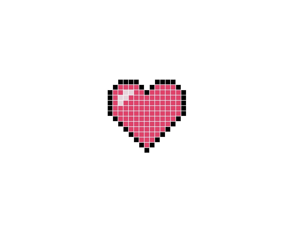
That's all about it. I hope you find this post useful, and I would love to see the creations you make your own by using this as a guide.
You can find the code for this pixel art on my CodePen and follow me on twitter for more updates.